I study Computer Science and Technology at Tec de Monterrey and I’m a student at the Apple Developer Academy in Naples, Italy. With that profile, you might assume I have a strong command of Swift and SwiftUI. The truth is, I don’t. I wouldn’t consider myself to have an extraordinary mastery of either.
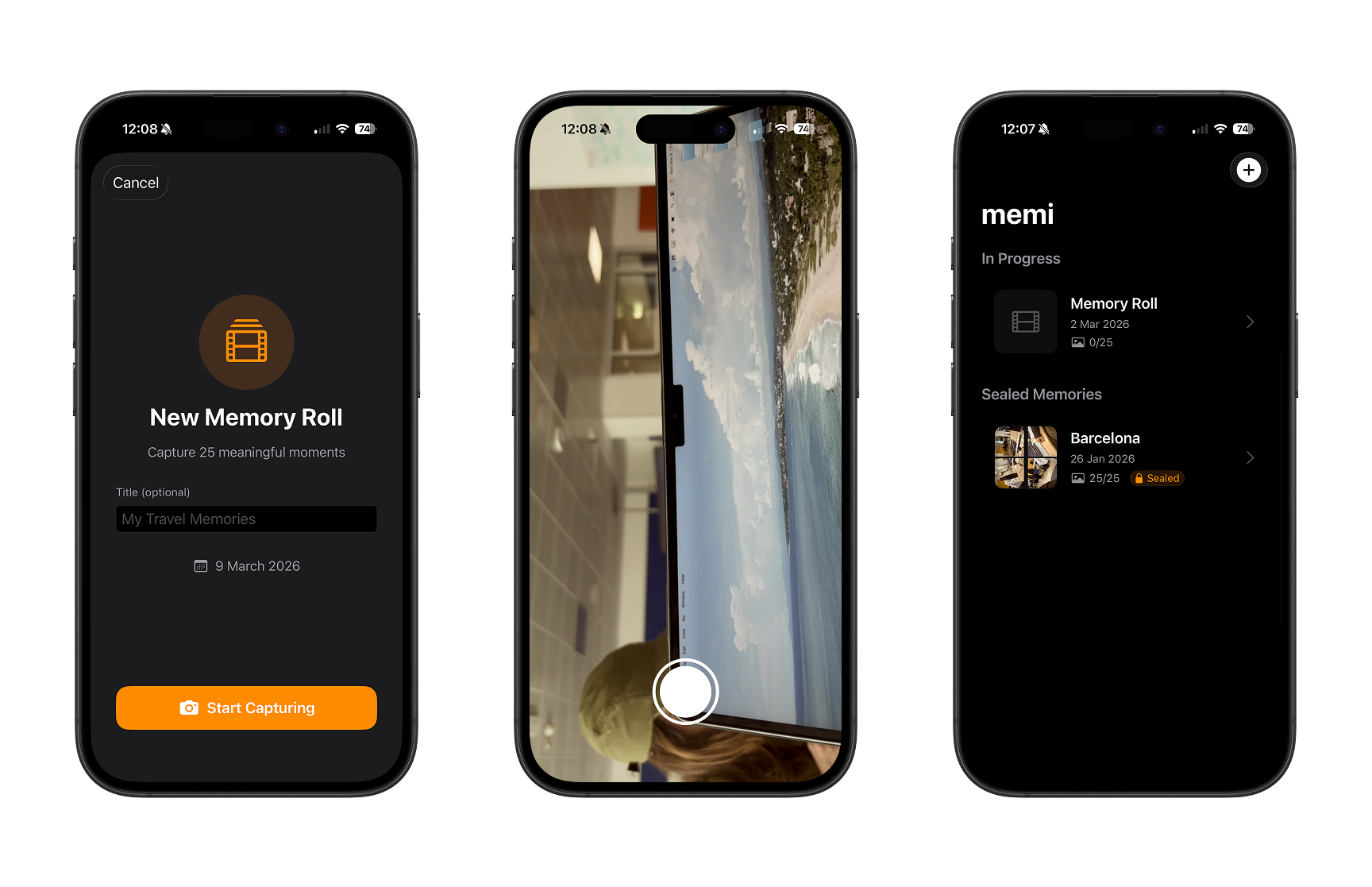
And yet, in February 2026 I submitted a functional application to Apple’s Swift Student Challenge: iDeary, a space to capture, connect, and visualize ideas as an interactive mental map inspired by graphs.
This blog is not a technical tutorial. It’s an honest documentation of my process: from having no clear idea at all, to submitting the app after a 24-hour all-nighter. I’m writing it because I believe the journey matters as much as the result, and because I want it would be nice if it served as a reference for anyone thinking about participating.
What is the Swift Student Challenge?
For those unfamiliar: the Swift Student Challenge (SSC) is an annual competition by Apple for students around the world. The challenge is to develop an app that demonstrates creativity, technical skill, and a meaningful experience — all evaluable in approximately three minutes. Winners receive recognition from Apple, exclusive merch, and in some cases an invitation to WWDC.
In the SSC 2026, the deliverable was an iOS or iPadOS app packaged as a Swift Playground App (.swiftpm format). In addition to the app itself, you must answer a series of written questions explaining what you built, why, and what you learned. That written portion matters as much as the app: it’s your voice behind the code.
The beginning: a goal written in an airport
It all started at the end of 2025. At the Academy, we were told about the SSC — one of the mentors invited us to participate. They made it clear that due to the rules of the challenge, they couldn’t give us extensive feedback like on other projects, but the motivation was there.
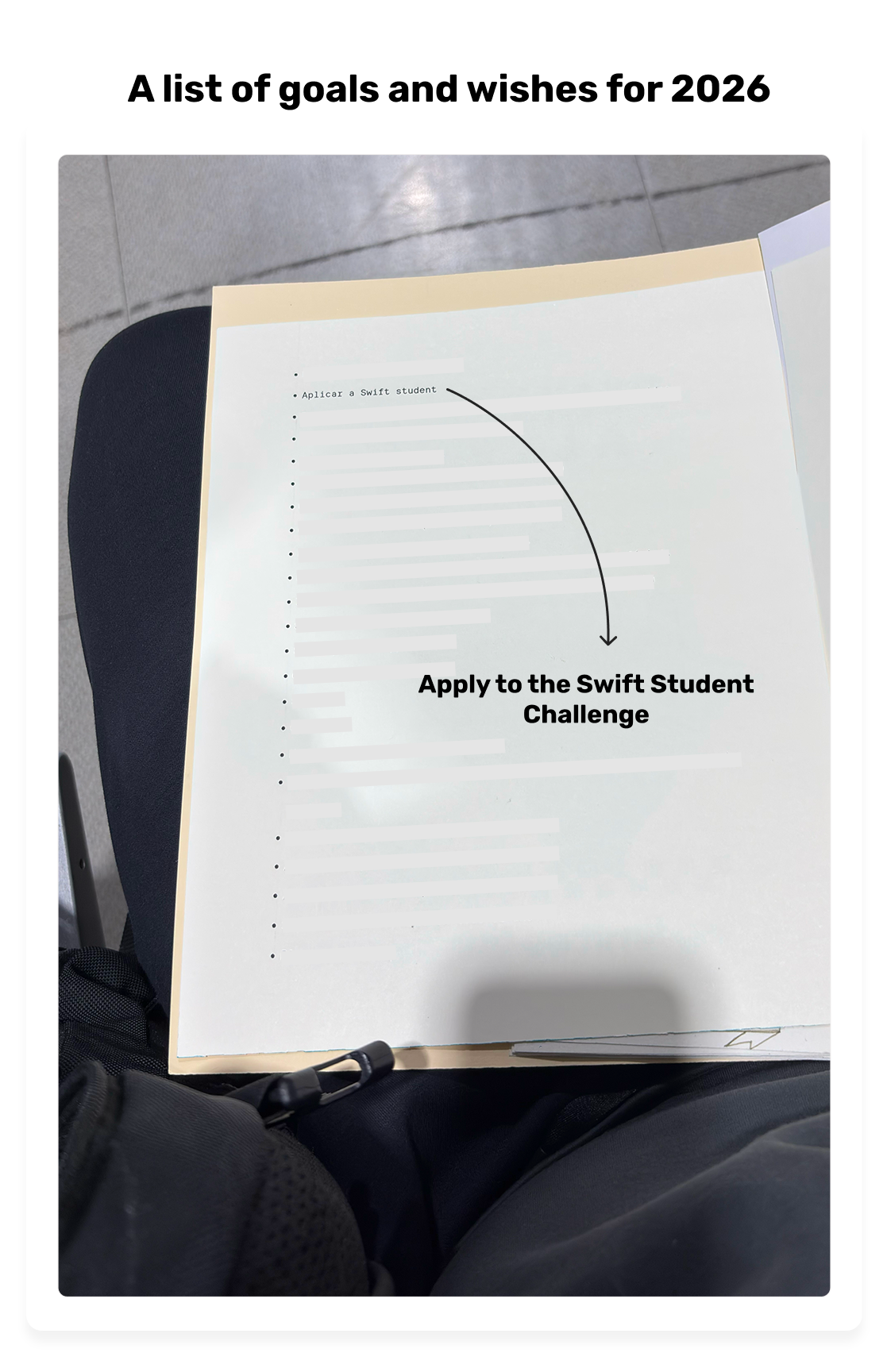
On January 5, 2026, in the waiting area of Mexico City’s airport, waiting for a flight to Rome on my way back to the Apple Academy in Naples, I wrote my goals for the year on a piece of paper. One of them: participate in the SSC. But with a condition I set for myself: I didn’t want to participate just to win. I wanted to build something that would genuinely be useful to me and that I would enjoy developing — including the all-nighters and the stress.
I had seen projects from previous years and none of them fully connected with me as a reference. I decided my project had to come from something personal.
The first idea (and why I scrapped it)
The entire month of January went by asking myself: what do I build? No idea completely hooked me. I quickly developed a prototype of an instant camera designed for travel: the idea was to capture memories with notes, not just photos you end up forgetting.
I liked it, but it felt too similar to MoMo, an app I had developed with my team at the Academy. The premise was comparable and I couldn’t find a personality of its own that would set it apart. So I left it as a prototype and decided to start an ideation process from scratch.
The lesson here was important: knowing when to kill an idea is as valuable as having a good one. My criterion for scrapping it was simple: if I couldn’t articulate it as something distinct from what already existed in my own portfolio, a judge wouldn’t be able to either.
Ideation process: from brainstorming to a moment of clarity
With the deadline looming, I took an entire day for an intensive brainstorming session. The rule: generate ideas fast, no filter, and by the end of the day have at most three candidates.
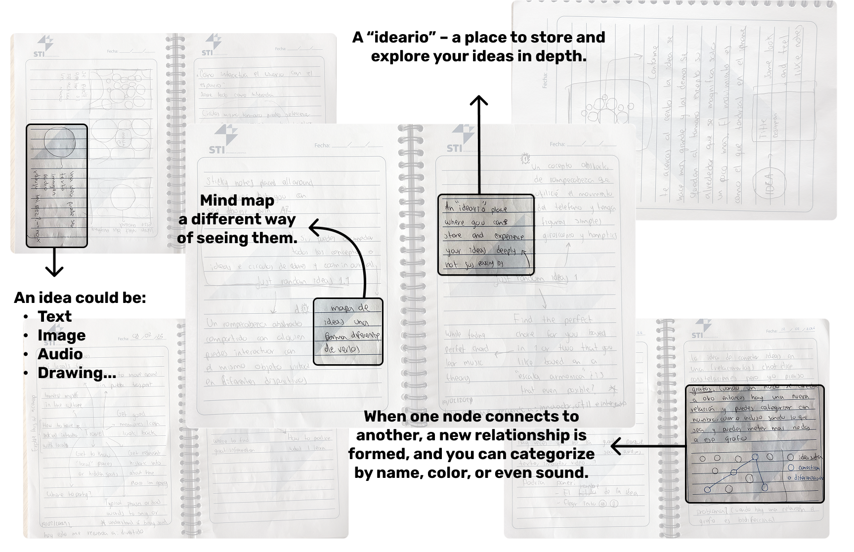
I did two rounds. First, I started from concepts that interest me: my hobbies, things that frustrate me, tools I use daily. Then I did a round of “random ideas” to see if I could connect concepts together. And that’s when the word appeared: ideario.
A diary of ideas. The word itself in Spanish didn’t refer to exactly what I wanted to represent, but the concept grabbed me: a space to capture, relate, and view your ideas quickly, simply, and in an integrated way.
I went over all the times I’d had an idea and lost it because I didn’t write it down in the moment. Or the times an idea grew when I related it to another concept. I thought: “this is exactly what I need and I genuinely want to build it.” In that moment, I knew what I wanted to develop.
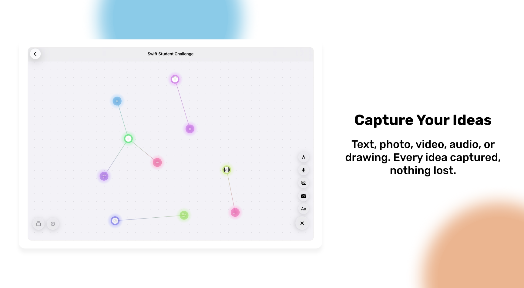
Designing iDeary: from circles to graphs
Quick capture
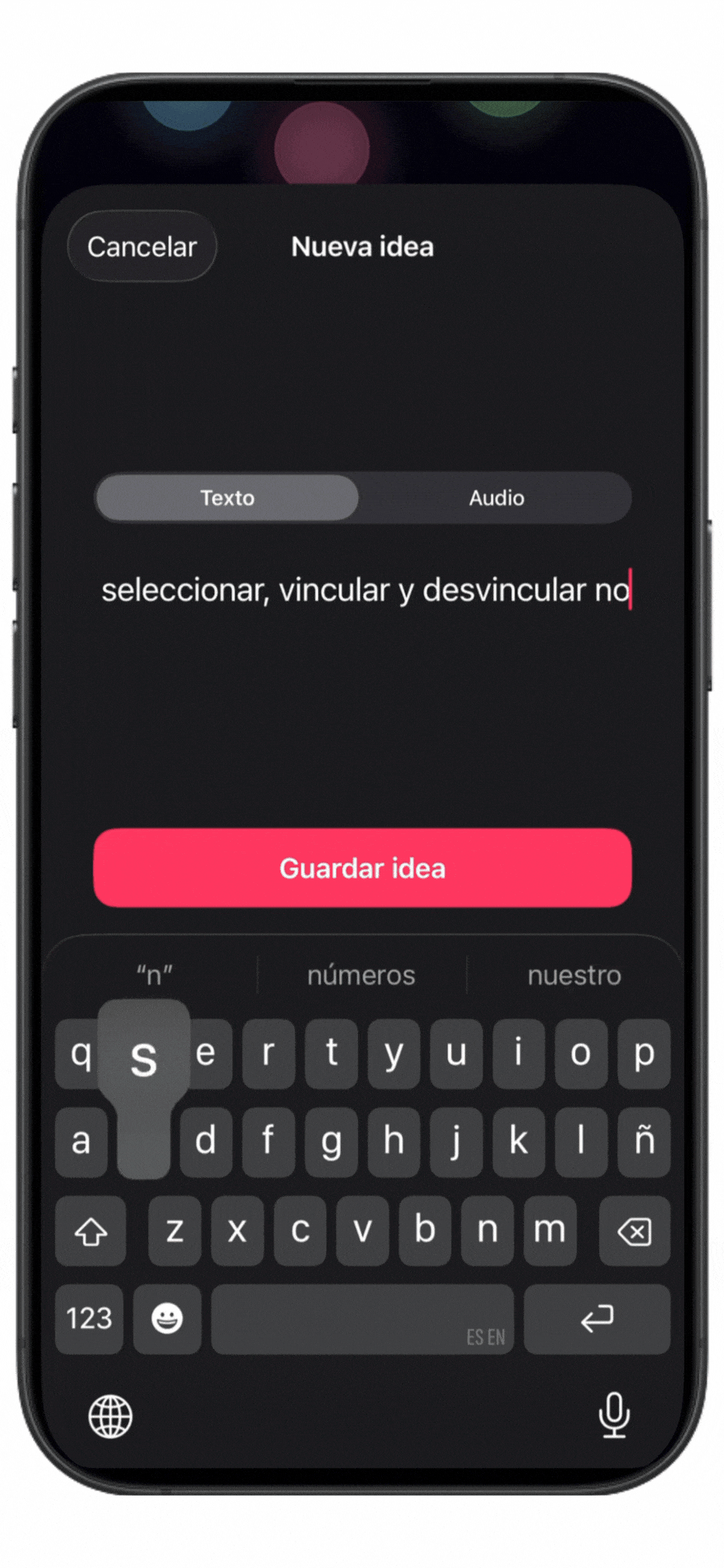
The first functionality I defined was capture: it had to be immediate and flexible. Write text, take a photo, record audio, make a drawing. Don’t let the idea escape.
Visualization: the key piece
There’s no point capturing ideas if you can’t revisit them in a clear way. This is where I iterated the most.
From the beginning I knew I wanted to represent ideas as circles. I thought about Pixar’s Inside Out and how an emotion arrives: suddenly and by reaction. An idea arrives the same way. That analogy felt pretty good and guided all the visual design.
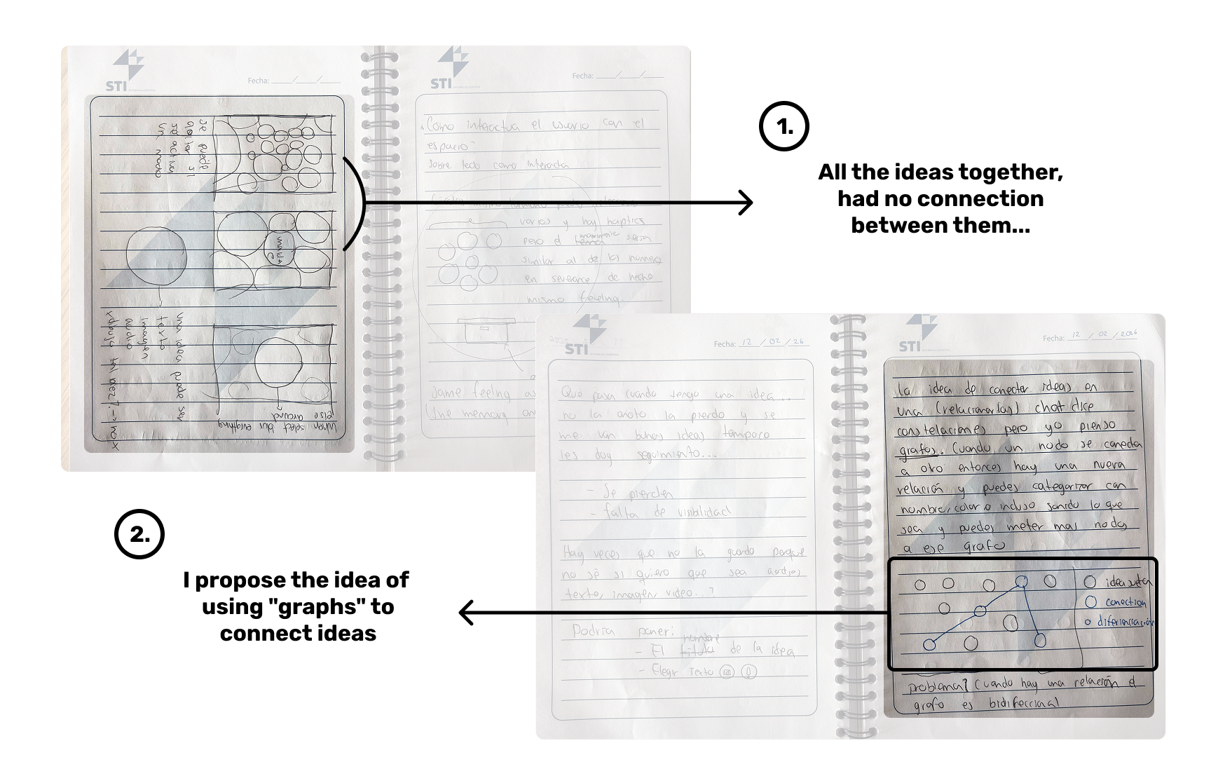
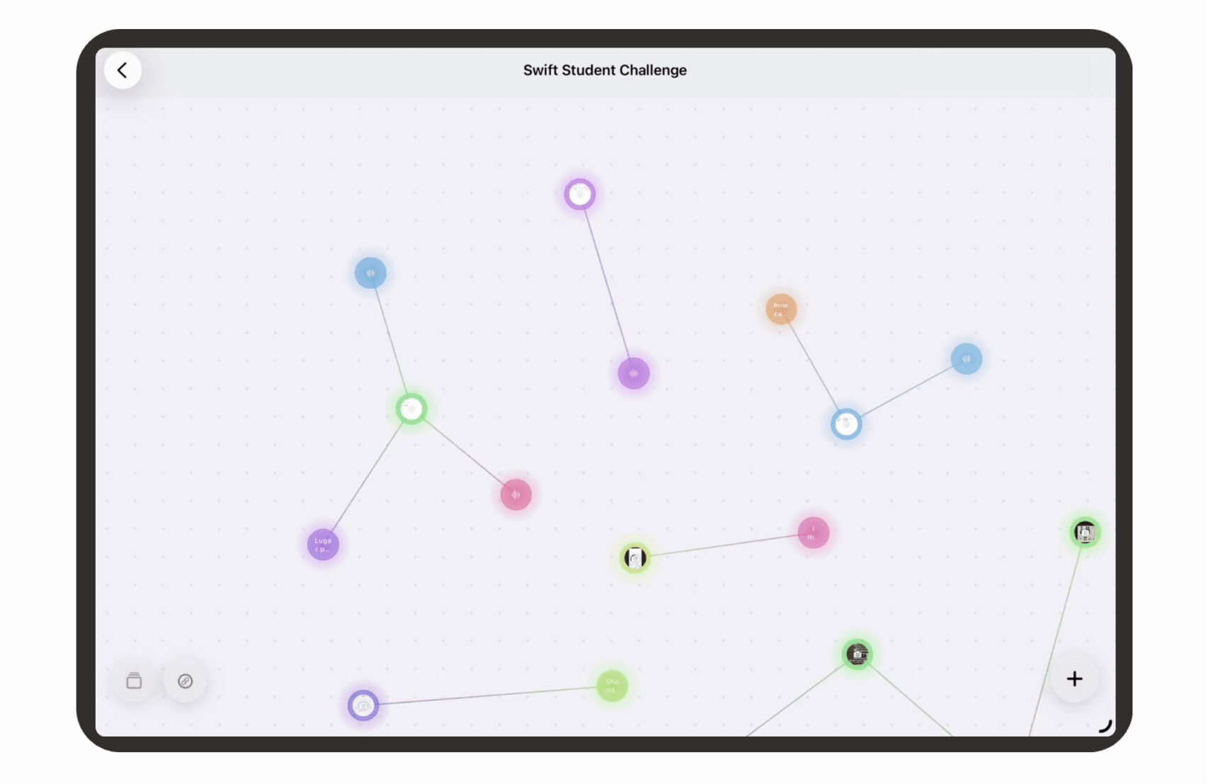
But the most important piece was missing: how do ideas relate to each other? That’s where my ITC side connected with the design. I remembered my Algorithms and Data Structures class and it came to me: graphs. Each idea would be a node with its information, and the edges would represent the connections between them.
For someone technical, it’s a graph. For someone non-technical, it looks like a mix between a mind map and a neural network. That duality convinced me it was the right representation.
From paper to Figma (and quickly to code)
I spent just enough time in Figma to have a digital reference. I won’t lie: it wasn’t pretty. But my working thought is that once I know what I want to build and roughly how it would look, I prefer to jump into code as soon as possible. Figma helps me think, not polish.
I started with the code to discover what was technically possible and how what I had in my head would feel in practice.
Development: from MVP to app
Technical build
The entire app is built in pure SwiftUI. I didn’t use SpriteKit or physics frameworks: the infinite canvas is a SwiftUI view with drag (pan) and pinch-to-zoom gestures implemented by hand, with scale limits between 0.3x and 3.0x. Each node is a view positioned via an offset calculated in canvas coordinates, and the connections are strokes drawn with Path directly in SwiftUI.
For the graph data structure I used something simple: two arrays of Codable structs. An array of Idea (the nodes) and an array of Connection (the edges), where each Connection stores the UUIDs of the two ideas it connects. No graph library or external dependencies: it’s the most direct model I could build, and it works.
For persistence, I didn’t use Core Data or SwiftData either. I serialize everything to JSON and save it to the app’s Documents directory, with one file per idea map. Simple, portable, and easy to debug.
For multimedia features I used Apple’s native frameworks:
- AVFoundation for audio recording and playback.
- PencilKit for hand drawings.
- PhotosUI for selecting photos and videos from the library.
- The camera with
UIImagePickerControllerwrapped in SwiftUI.
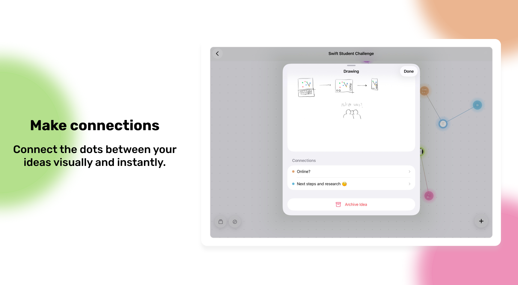
The most interesting technical challenge was building the connection mode between ideas. The flow is: the user activates connection mode, taps a first node (which becomes “selected”), taps a second node, and the app creates the connection showing a gradient line between them. Managing that “waiting for second node” state reactively in SwiftUI, propagating state changes between views without everything blowing up, was what cost me the most iterations.
Another architecture decision I’m glad I made: separating IdeaStore (the state of a specific map) from MapStore (the list of all maps). Each map has its own store, which makes adding, deleting, or switching between maps clean and without weird side effects.
The day-to-day process
I worked on the app every day, not just because of the deadline but because I genuinely enjoyed it. I remember being on a bus from Naples to Milan (approximately 11 hours) to surprise my girlfriend on Valentine’s Day, and I spent half the trip coding. I was in “the zone”.
The first development iteration was a very basic MVP: I just wanted to know if the idea in my head made sense as an application. And even though it was simple, using it made me realize it was genuinely useful to me. I also tested it at the Academy and the reception motivated me to keep going.
Testing and feedback
When the app was more than a prototype, I started testing it with everyone I could. The feedback I incorporated wasn’t about changing the core idea, but about improving the experience: making it clearer how to add ideas, how to interact with them, how to navigate the map.
The most recurring issue: people didn’t initially understand that they could connect ideas together. That feature wasn’t obvious. This led me to redesign the connection mode button, add contextual on-screen instructions during the connection flow, and finally build an onboarding that guides the user to connect ideas as part of the tutorial.
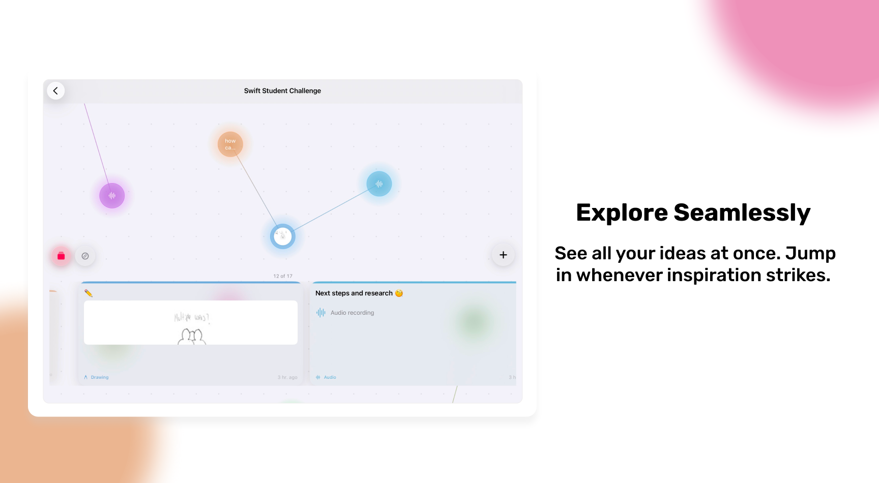
Solving quick idea exploration
I had the idea map, quick capture, and connections. But something was missing: how to quickly explore what you’d captured without having to navigate the entire graph? If you can’t revisit what you captured in an agile way, there’s no point in having saved it.
I imagined a carousel — a recognized pattern in mobile and web interfaces. Researching, I found an exercise from Apple WWDC ‘23 (“Animate with Springs”, session 10159) that implemented exactly the experience I was looking for.
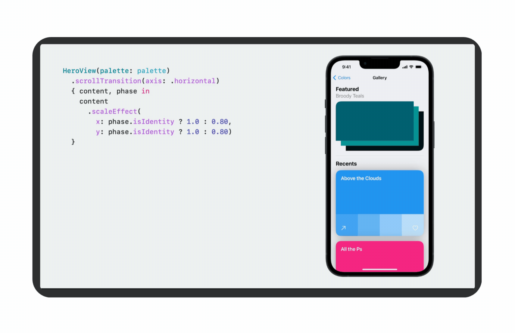
I went through the exercise, adapted it to my app, and the result was exactly what I had imagined. The carousel went through many iterations from sketch to implementation.
In the end, the carousel navigation wasn’t the most-used feature in the app, but it’s a subtle detail that improves the experience as you use it more. Sometimes the most valuable features aren’t the most visible.
Final details before submission
A few hours before the deadline, the app was working but I was missing three critical things: onboarding, an icon, and the SSC written answers. I had to split my attention in parallel.
The onboarding
The onboarding had a dual purpose. On one hand, guide a new user to understand how the app works. On the other, meet the requirement that the experience can be lived in three minutes. Since I imagined the judges evaluate many applications, I decided to also use the onboarding to explain the why of the app, not just the how.
The flow guides the user to create an idea, explore the capture forms (text, photo, audio, drawing), connect ideas together, disconnect them, and navigate between them. And it starts with something not so common in onboarding: my story. I tell the user why I built this. I wanted it to be clear from the very first second that iDeary was born from a real problem, not a technical exercise.
Tools that helped me
For the onboarding, I used Claude Code as a support tool. Specifically, I used it to take the base structure of my existing code and generate the step-by-step onboarding flow, which I then personalized and adapted to my app’s context. The application logic, experience design, and product decisions are mine; Claude Code helped me execute faster.
For the icon, I used Apple’s Icon Composer, while simultaneously answering the SSC questions.
The submission
The submission boils down to a continuous 24-hour session: polishing the final details, answering questions, and hitting send. I was fortunate to be accompanied by my friends and fellow Apple Academy students. We got to work together all night, testing each other’s app fixes, giving feedback, keeping each other motivated. We submitted together, each at their own hour.
Doing it as a community wasn’t a minor detail. It was what helped us stay focused and feel like we weren’t alone in the stress.
What I learned (and what comes next)
I didn’t get the chance to polish the UI, UX, or accessibility as much as I would have liked. I’m content with the final result, but not satisfied — and I think that distinction matters. I want to keep learning, refactor the code, and above all, publish iDeary.
What kept me working wasn’t just the SSC as a goal. It was that from day one I knew I was building something I’d use myself. And when the people who tested it told me they’d use it too, that changed everything.
If I could do something differently, I’d start accessibility design from day one — not as a last-minute checkbox. VoiceOver, Dynamic Type, color contrast, or whatever fits iDeary best given its nature. Thinking about this from the start changes how you design: these aren’t details you add at the end, they’re decisions that shape everything else.
I’d also spend more time testing with people who don’t know me, because feedback from someone who knows nothing about the app is the most valuable — and the hardest to get.
If you’re thinking about applying to the SSC, I’d say: choose an idea you yourself want to use. Something that moves something in you and makes you want to keep learning and building, because stressful, sleepless nights are coming. But making something because you genuinely want it and find it useful has a kind of value that shows. Fall in love with your idea and with the process. And one more thing — a practical one: start before you feel ready. The ugliest prototype in the world will teach you more about your idea than any amount of time thinking about it.
What’s next
The plans for iDeary post-SSC are clear: refactor the code, improve accessibility, explore sync across multiple devices, and eventually publish it to the App Store. There’s a more complete version of this app waiting to be built.
iDeary technical summary
A quick look for those who want to understand the stack and technical decisions without reading the entire post.
- Platform: iOS (Swift Playground App,
.swiftpmformat) - Language: Swift
- Main framework: SwiftUI
- Multimedia: AVFoundation (audio), PencilKit (drawings), PhotosUI (photos and videos), UIImagePickerController (camera)
- Graph data structure: Two arrays of
Codablestructs:[Idea](nodes) and[Connection](edges). No external libraries. - Infinite canvas: Implemented by hand in SwiftUI with drag and pinch gestures. Scale: 0.3x - 3.0x.
- Persistence: JSON serialization to
Documentsdirectory. One file per map. No Core Data or SwiftData. - Animations: Spring animations based on WWDC '23 session 10159. Node pulse with
withAnimation(.easeInOut)in loop. - Architecture:
MapStore+IdeaStoreper map +AudioManagerandMediaManageras independent services. - External tools: Claude Code, Icon Composer (icon), Figma (wireframes and references)
- Lines of code: ~5,800
- Total development time: ~6 weeks (January-February 2026)